


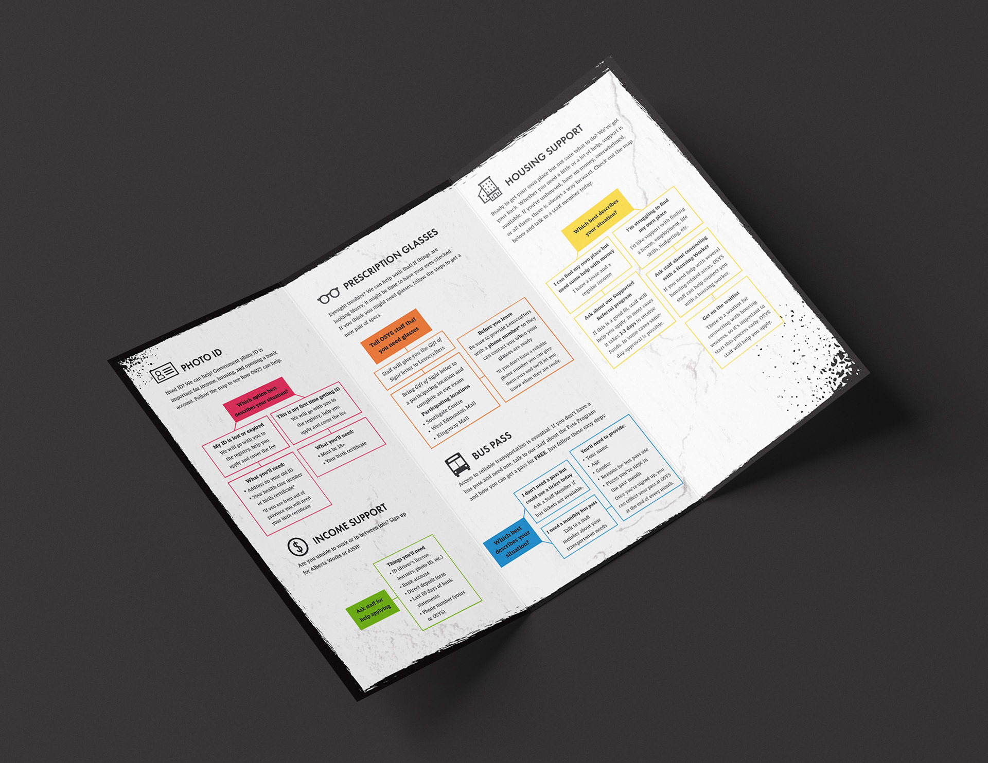
Keeping in line with the rougher aesthetic of the Society's branding, the brochure cover features a section of the mural from the old OSYS building, painted by AJA Louden. (@ajalouden)
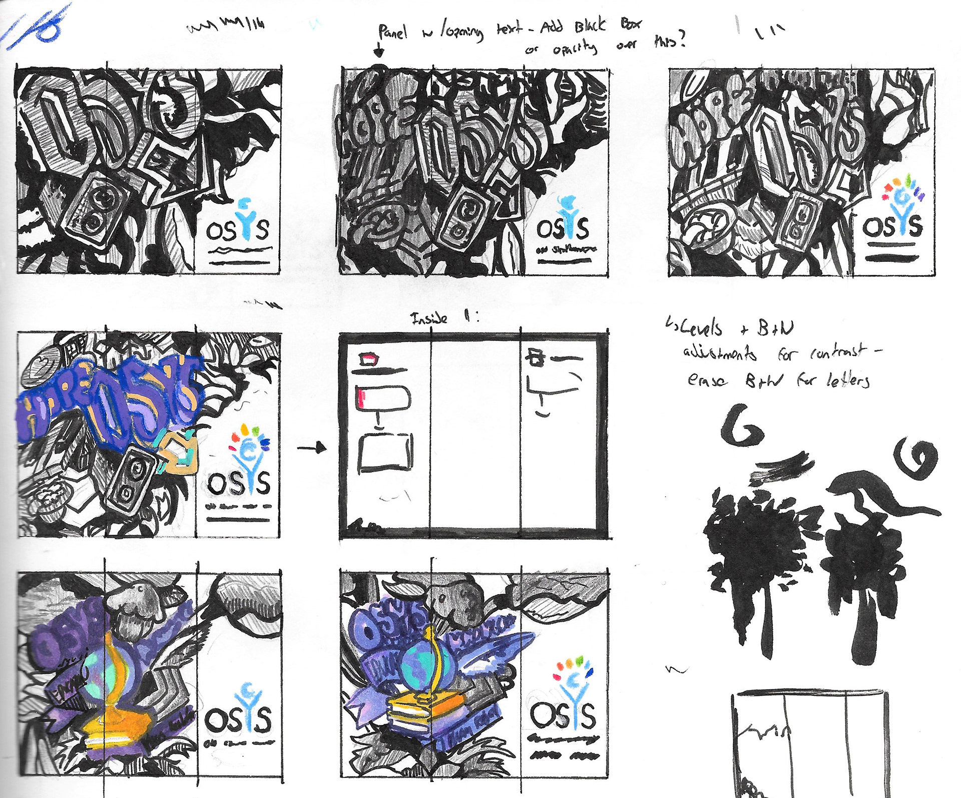
Sketches and process work for the brochure. Features of OSYS branding include high contrast black and white imagery, and rough graffiti/spray paint textures with spots of bright colour.